General
Figma guidelines for creating and exporting blog posts key visuals with the template for Key Visuals.
- Dimension: 1200X600 pixels
- Export settings: 2X PNG
- Wiredcraft Colors: Wiredcraft Colors are already Imported from Team Library. They can be selected from the right panel → Color Styles
- Pixel Grid: Any that is a multiple of 5 (default to 25)
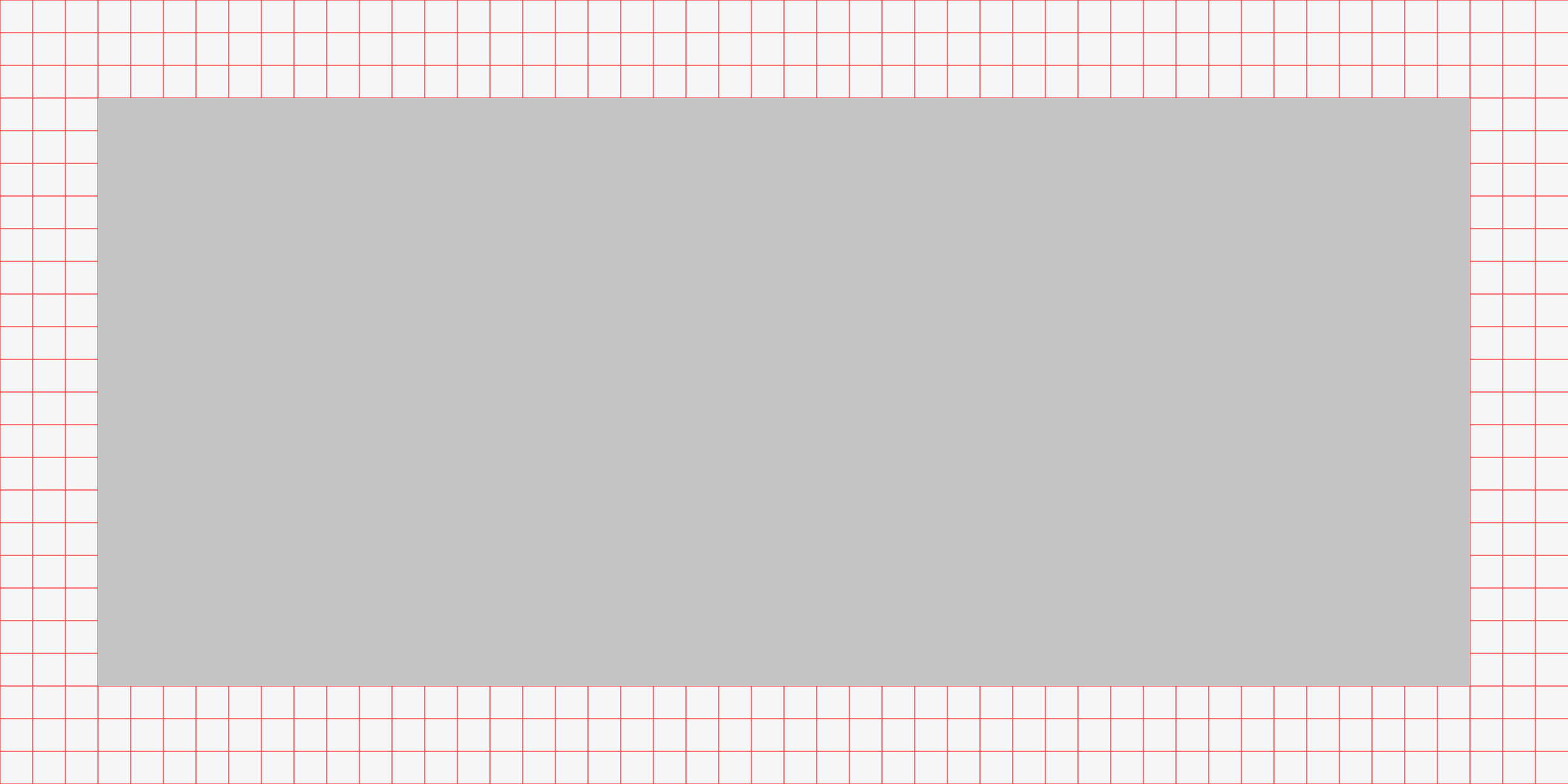
- Margins: 75px
Working with Photographs
Below steps will help you find a photograph online, import it onto the Figma Key Visuals Photographs page and export your masterpiece.
- Define your search terms
- Search according to the verbs and keywords in your headlines or content.
- Find variations of your search terms (Google search for “[keyword] synonym”).
- Search for nouns related to your verbs, e.g. “launch” could mean rockets or race cars…
- Enter terms that have to do with the image you have in mind.
- Searching for images — Here are a few places where you would go to source free stock images.
- Quality — Making sure the image is good quality (light, contrast, sharpness…).
- Make sure the resolution is min 72dpi.
- Picture will be clipped to 1200X600 pixels, don’t use anything smaller.
- PNG format is preferable, most likely you’ll get a JPG which is ok as long as the compression is not too heavy.
- Make sure you have permission to use it!
- Importing your image
- Open the Figma Key Visuals Photographs page.
- Right-click copy your image from the browser.
- Paste or import from PC (command-shift-K).
- Select Frame you wish to export.
- Select PNG 2X and it Export.
- If your export is <1000KB you should reduce file size with ImageOptim (disabling Lossy Minification)
Working with Vectors
Follow these steps to create an illustration with the Figma Key Visuals Vectors page.
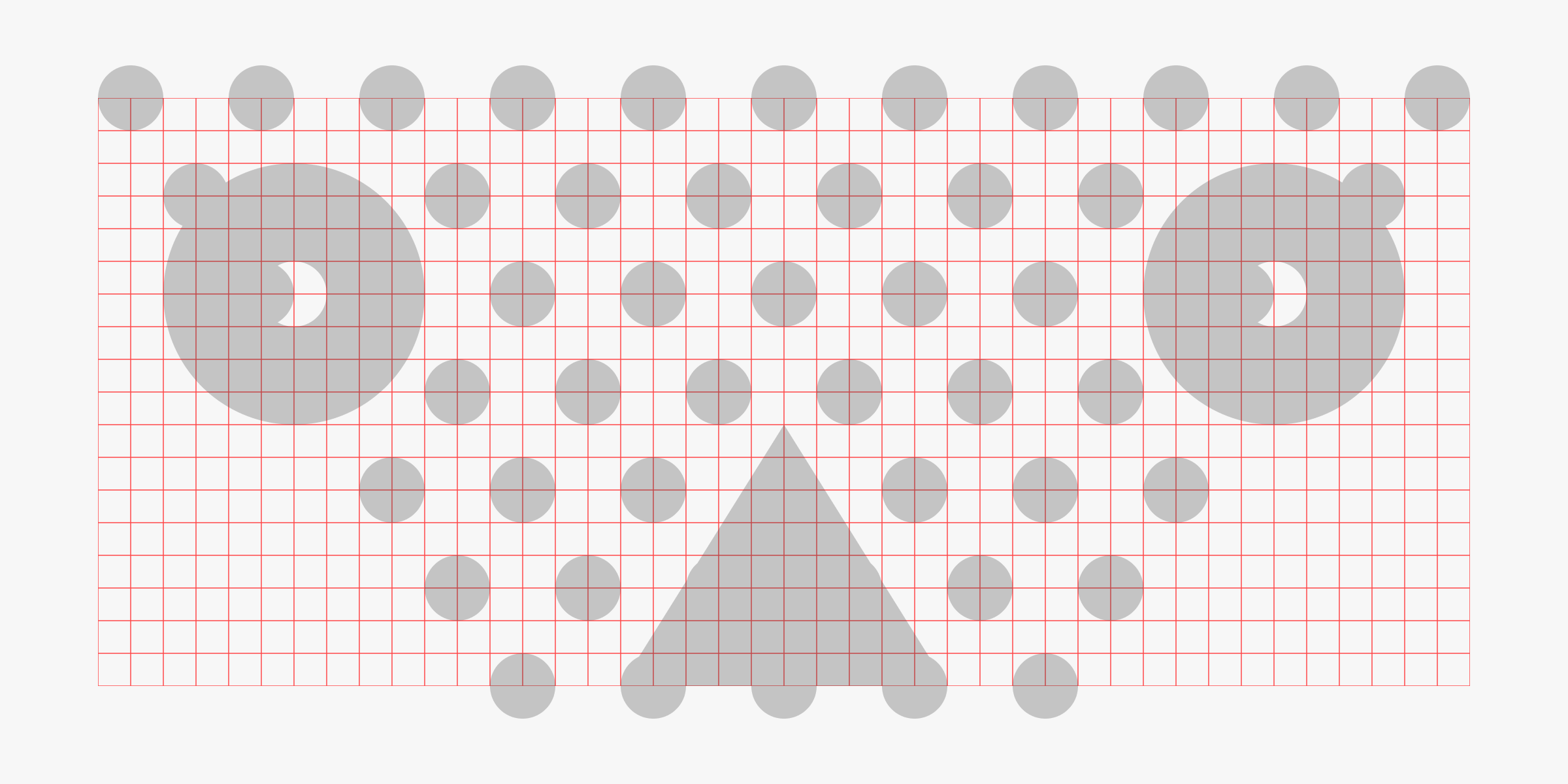
- Find your hook – Read the draft of the article and extract a general idea from it that has the potential to engage on a wider level. The more abstract the better (ie. direction, connexion, speed, network, interaction, time, space…)
- Illustrating the idea – Stay away from complex representations or over simplified cliched symbols such as a heart, a logo or a flower. There are already hundreds of these images floating about, so your piece is never going stand out. Instead look for abstractions and high-level interpretations. No need to match the content in a painfully literal way. Inspiration can be found in Bauhaus and Brutalist art movements. If you’re really desperate you may Google the theme +”vector” and see how it is represented globally, or you may also research its opposite.
- Building blocks – Once you’ve settled for a graphic representation, redraw the basic shapes onto the frame. Make sure ‘Snap to Grid Pixel’ is enabled to ensure your components fall onto the grid. You may want to adjust the second grid to match your patterns, just make sure the grid is a multiple of 5. Then turn these basic shapes into components and use these components to create larger shapes.
- Use a greyscale - To begin with, work in greyscale and limit the shades to 3. This will force you to refine the overall contrast in the composition by adjusting sizes and granularity.
- Adding colors – Once the composition feels right and resonates with the theme (even just loosely), you may apply colors. No more than 2 distinct colors picked from the Color Themes, with one additional shade derived from one of the main colors. Note: You are restricted to colors picked from the Color Themes but if you need a hint of how to combine color tones harmoniously, check out Material Color Tool.

Working within constraints
A few Do’s & Dont’s that will help build on a distinct visual language. Constraints can be adjusted after a direction clearly stands out.
- Keep it simple. The idea should be simple enough to be executed with paper and a pair of scissors.
- Don’t use complex shapes imported from other apps.
- Don’t use 3D.
- Don’t use colors that aren’t from the Wiredcraft Colors or a shade of these.
- Stay away from gradients and transparencies.
- Don’t use Figma effects: shadows, blur, etc…